
 So me and a buddy went to see Ironman 2 at midnight last week. It was ok. I don’t know if it was as good as the original. It seemed like there was just too much of Tony Stark being an ego maniac and not enough of Ironman fighting. Don’t get me wrong, Robert Downey Jr. is one of my favorite actors but I’m a guy and I came to see stuff get blowed up. I don’t really want to get too critical ’cause I really did enjoy the movie, but really, making a particle accelerator in your basement propped up with books and tool boxes was just a little too much for me. I saw a show on TV about repairing the Hadron super collider and it was practically the most delicate and complicated thing on the planet with the possibility of creating a black hole if you mess something up. So, yeah you are cool Tony, but that was a little much. I also don’t understand why the bad guy’s whips can cut through a Rolls-Royce in a single swipe, but the upgraded whips still couldn’t cut through Ironman’s neck after 5 minutes of direct contact. Whatever. I have to say, one of my favorite parts was the little shout out to Daft Punk when DJ AM plays “Robot Rock” during the party fight scene. Oh Daft Punk, how I love you. Either that was my favorite part (because of the music, not the drunken robot brawl) or the constant examples of how stupid politicians are. Its a close tie I’d say. So, long story short, the moral of the story from Ironman 2 is: Daft Punk is awesome and the government messes everything up always.
Robot Rock
Posted in Uncategorized
Leave a comment
Self Portrait
 For my art marketing final we had the assignment of creating a website to promote ourselves. I have no idea how to turn what I drew on illustrator into a functioning website but I did make some pretty decent page designs though. That’s besides the point though. As part of the design for the web pages I decided to do a self portrait. I have been thinking about doing one for a while and this gave me an excuse to actually make one. Of course its highly stylized and I had to throw in some of the graphics from the other pieces I have been working on lately. I think it turned out pretty good. For all those wondering, no I did not just plug my picture into one of those stupid obamanizer websites like everyone else and their mom even though it is a similar style. There are a few parts that I think I need to change and I welcome anyone’s critique, but I am mostly satisfied with the first draft. At least it looks like me, which is always good when making a self-portrait.
Posted in Art
Leave a comment
Wedding Invitation
 So the biggest news in my life right now is that I am getting married. Its only a few weeks away and all I can say is that its about time. Anyway, because we are poor, I got to design my own wedding invitations. I designed these like four months ago and we just barely sent them out a couple of weeks ago. I did basically everything except hold the camera. A good friend of ours

helped us out with the photography and I edited them with the effects and did all the layout and design, front and back. I put placeholder text in just because its the internet and in case I put these in my portfolio. If anyone feels bored May 22nd then feel free to come by and see us. Just email me and I’ll send you a copy with some information on it.
Posted in Art
Leave a comment
Arizona Fusion Logo
 About a month ago my fiancee told me that she needed me to design a logo for one of her class projects. She is graduating from ASU next week and was doing her final project where she and her group had to plan an event and make a presentation. So I got to make these logos and design posters and all kinds of stuff for them to use. I used the shape of the state of Arizona and the Arizona state flag as a basis for the logo. The event took place in Phoenix, Flagstaff and Tucson so the colored ribbons in the logo originate where the cities would be on the map geographically. I noticed the other day that the font I was using was almost the same one they used for all the text on the DVD case of Avatar. Kinda weird how you notice those kinds of things. So if anyone is wondering, Avatar uses the Parchment font that comes with the Adobe creative suite or at least something dang close to it. Anyway, I guess it was a big hit in her class and the teacher said that he would use it himself if it were a real event. Not bad for 2 hours of work.
Posted in Art
Leave a comment
Static and Sand
 So about a month ago I was pining about not being able to go to Coachella when we were given the assignment to design a poster. I decided that we needed a good indie electronica music festival in Arizona so I made one up. The poster advertises for the Static and Sand music festival which I hope someday there will actually be something that resembles it here. The dates are set for next year so somebody better get cracking. The list of bands is basically just a list of my favorite bands that I thought would go good together and keep with some sort of theme for the festival and are ordered from most prominent to least. It would be just out in the desert somewhere and they would blast crazy indie\electronic\experimental\trip hop all night long from multiple stages. The colors are pretty wild which I think is true to the type of music that will be played there. In certain places its gets a little hard to read I think so it could probably use some work, but I’m kinda sick of working on it unless someone actually wants to make it happen. I’m waiting!
Posted in Art, Music
Leave a comment
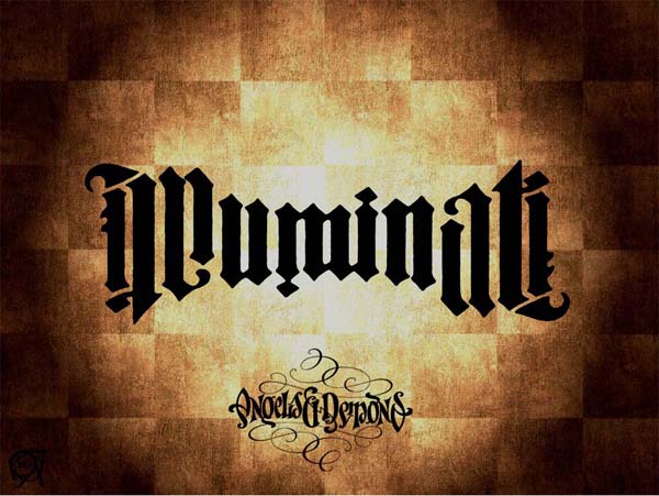
Esoteric Design Studios
I designed this logo a couple of weeks ago for our final project in art 169. The idea for the company was to have a studio that designs stables of characters and genre universes that will be applied and marketed through the whole spectrum of mediums. Other companies have eventually built up their labels to the point of crossing into other mediums, but we specifically have this goal in mind from the very start. When we design a group of characters we think about how we can develop them into comic books, movies, video games, coloring books, T-shirts, novels, fine art and everything in between.  The logo itself was inspired by a couple of different things. First of all, I watched the movie Angels and Demons a couple of weeks ago and thought it would be cool to design the logo after the ambigrams that the Illuminati used. Since the word Esoteric means mysterious or obscured it seemed appropriate to have a logo that was modeled after that of a secret society. I also remembered an artist that I saw in one of my favorite books called Masters of Deception that highlighted an artist named Scott Kim that specialized in these types of drawings. This guy is a freaking genius. Anyway, someday I will have enough money to buy this book. Tangents aside, The logo was inspired by all these things and more. I am fairly pleased with how it turned out and welcome any critique.
Posted in Art
Leave a comment
Business card
Last week I finished making the business card for our final project in art 169. The card has the Esoteric anagram logo and the text is repeated on the top and bottom so either way you look at the card it will say the same thing.

Esoteric Business Card
There are also cut outs on the sides that help give it an interesting shape and emphasize the logo. It has the same kind of old antique mysterious look that takes its inspiration from Gothic architecture and complex engravings.
Pandora Radio
Maybe some of you have had the privilege of discovering the wonder that is Pandora.com. This has been one of my greatest tools in my never ending search for some interesting sounds to fill my days. I usually listen to Pandora Radio to get leads on new music and then explore out from there. Pandora is awesome, but lately there has been some problems in our relationship. Apparently now they have decided to pay royalties for the songs they play instead of having artists pay them for the exposure. So the result is commercials, interruptions making sure that I’m still listening so they aren’t wasting bandwidth, constantly pitching me the benefits of upgrading and now the latest offense is that I am only allowed to listen for 40 hours a month. What! This month was a light month as far as my listening time goes and I still have to get through 3 more days! This is putting some serious stress on our once blissful, nearly four year relationship. Looks like I’m gonna have to upgrade to Pandora One. It better be everything they claim it to be and more. Either that, or kick everyone else that uses my account off to find their own.
Posted in Music
Leave a comment
Learning WordPress
So as I have been putting together my blog I have tried to make everything very organized with different tabs and pages and whatever all the dohickies are called. Now that I’m actually writing content I can’t seem to figure out how to make posts in all these different compartments that I put together. Kinda sucks that I spent all that time on it if I can’t even use it for what I want. What is the point of having separate pages if all you can do is write an intro paragraph and have people comment on that one thing? That is stupid if you ask me. Anyone got any tips?
Posted in Uncategorized
Leave a comment
